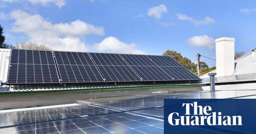
Australian households in three states will be promised access to at least three hours a day of free solar power, regardless of whether they have rooftop panels, the federal government has announced.
The “solar sharer” offer will be available to homes with smart meters – which is the majority of homes – in New South Wales, south-east Queensland and South Australia from July next year, with other areas to potentially follow in 2027.
The government said Australians could schedule appliances such as washing machines, dishwashers and air conditioners and charge electric vehicles and household batteries during this time.
More coverage on the ABC: Energy retailers to be directed to offer free power three hours a day
PS: Australia wastes a lot of our renewable energy because of insufficient storage during the day. The data of our energy generation can be seen on OpenElectricity [edit: fixed link]. The shaded section on top is the amount of renewables which are “curtailed” (turned off due to insufficient storage), and the little bit below the zero line is the amount that actually gets stored in batteries or pumped hydro.
Because coal power can’t turn on and off easily, we burn coal 24/7 for power and throw away 10% of our renewable generation. Hence this policy, to encourage more use during the day when we can use more renewable power. Some retailers have been already offering this as “happy hours” or “three for free” during the solar peak.
There are even a few retailers that vary their charges (pun intended) based on current (intended again) wholesale rates - because of all the excess solar, electricity through those providers is often completely free from 9-10am to 3-4pm.
Very cool about why they’re doing it!
But separately, i just looked at that chart at the top of the page, are you sure you’re reading that right? What you described doesn’t seem to be what the chart is showing. Maybe I’m the one reading it wrong, but the top chart is just showing amount of electricity generated by source type. Anything above zero is the amount of electricity that was generated.
This link should show curtailment on. There should be a white-shaded bit at the very top (if not, click on the box on the left side under “Curtailment” and next to “Renewables”).
Yup that link works now, thanks!